Flags up and waving
A couple of weeks ago the Logies of the Australian book world, the APA Book Design Awards, were held at the Powerhouse Museum. Usually I am a bundle of nerves and occasionally searing disappointment while keeping my beauty queen graciousness (but who is anyone kidding? When you don’t win an award it’s pretty sad). I am like this because for the last 6 years I have had one or two projects shortlisted for awards and last year I won two! Which I was particularly chuffed with especially since one of the books was my own {Graphic Design} Australian Style Manual – you know that book I authored, yeah no big deal.
But this year I was not shortlisted because I had been on part time maternity leave so didn’t have a huge folio of work published in 2012. Which yes, I got a pang of the sads when I walked into the ceremony but it was quickly washed away with the hilarity that came with relaxing and hanging out with my fellow designers and book publishing kin.
A big part of this evening is the networking, especially for us freelance designers. So I decided earlier in the year I was going to make ‘something’ to take and hand out. In my usual style I dreamt big, hand-made and quirky.
I designed a little flag for the evening. Its purpose was to celebrate the awards, book design in general and all the very talented people shortlisted this year – YAY Huzzah for book design! Wave your flag! On the back of the flag I updated my promotional illustration (I have a character of myself that appears on most of my promo material but I had to update my hair style as I hadn’t revised her since I had my hair chopped off) and reworked my logo. I used Great Lakes typefaces, of which I am now besotted. And then it was time to print!
Of course I used my Print Gocco, it’s my signature print style and I use it for all my own promotions.
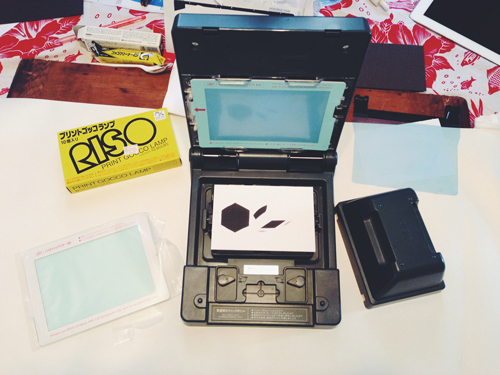
There were two plates for the front (black and white) and three plates for the back (black, white and orange).
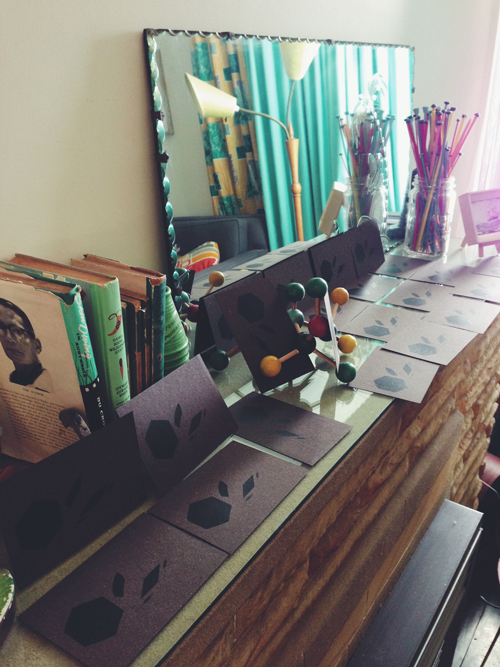
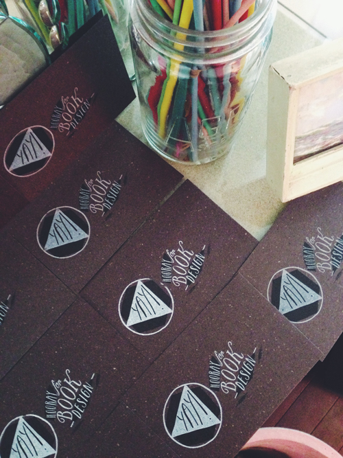
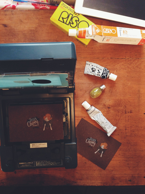
It was a little tricky and very time consuming as I had to attach the registration plate for every print, so 30 prints x 4. It was laborious but I was determined that each print would be as aligned as possible. I don’t mind mis-registered prints, I really like that style but I felt the illustration would suffer if anything was too off.
After both the front and back were done and dry, I creased and rolled the left edge of each card and glued it to a skewer. And after the glue had dried I cut the long edges to create the flag shape.
I learn a lot about the restrictions of craft with a toddler, it forced me to clean up the dinning table every evening and pack all my equipment away before hurricane toddler awoke the next morning and got his mitts on to anything. Yes, it’s forcing me to actually clean up after myself and take care of my equipment, ridiculous!
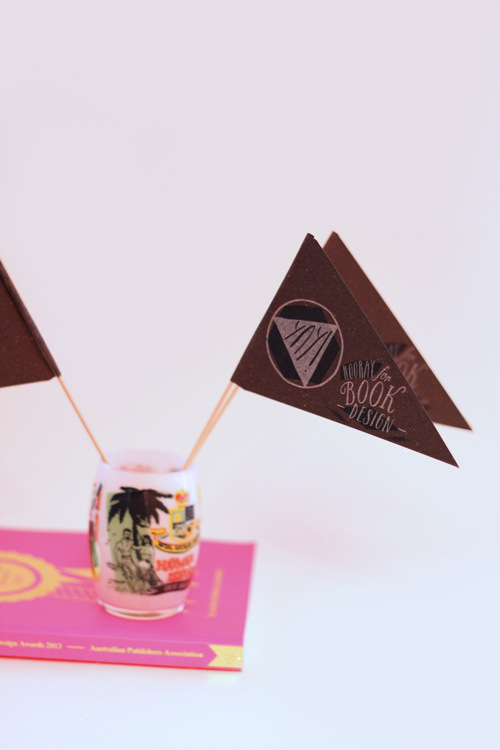
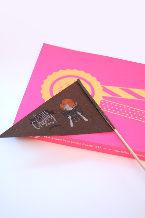
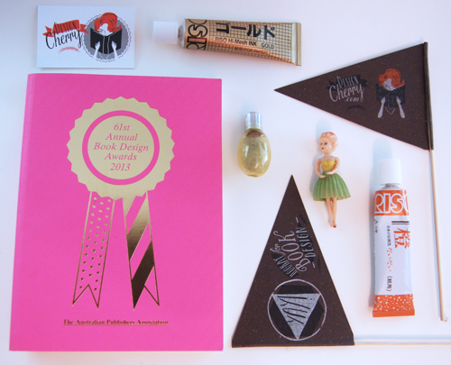
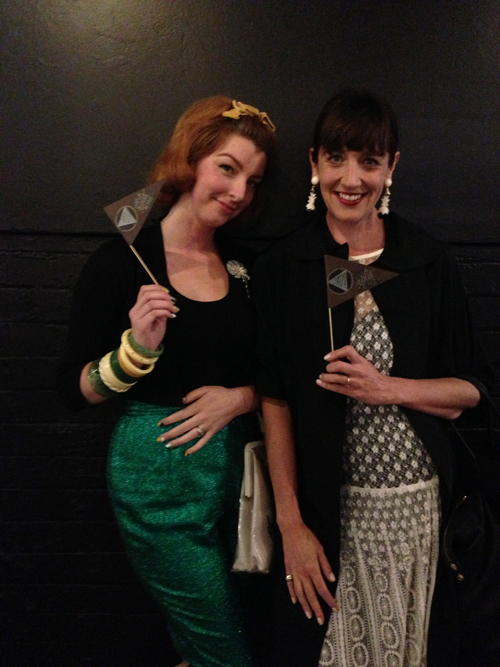
And here are the flags in action on the evening. Megan and I waved the flags furiously as her wonderful book Things I Love, and its designer won Best Illustrated book but I think I saw Megan’s flag fly across the room as she jumped to her feet when it was announced her book had won Best Designed Book of the Year.
Congratulations to all this years wonderful designers and YAY HOORAY FOR BOOK DESIGN!
