
What the Raven saw
This blog has been pretty chock full of baby lately and before it falls down the rabbit hole of ‘mummy blog’ entirely I thought I would break up the 52 week project with something interesting.
Over the last year since coming back from maternity leave I have been hard at work both lecturing in design but also with my freelance book design business. I won two book design awards: Best Designed Children’s Series: Star League 1: Lights, Camera, Action Hero! (internal design and typesetting) & Best Designed Further Education Book: {Graphic Design} Australian Style Manual (cover design – yes the book that I co-authored and art directed won!). And I have sold the rights to my Maria V. Snyder book cover designs to North America, United Kingdom and Spain.
Phew! It’s been a pretty busy year to say the least.
In June last year I received a brief from Random House for the cover of What the Raven saw. Which is a tale about a cranky Raven living in a churchyard and the lives (and unlives) that keep interrupting his peace.
One of the directions I got from the publisher was:
A classic fable for children and adults of all ages but especially readers aged 8 to 12.
After discussing the book and ideas we decided a paper craft/art cover would be amazing for this cover. It would symbolise the multi-levelled story along with giving it a classic, old-world style. Plus while playing around with ideas the illustrator, Tony Flowers, had already created 3D paper ravens that were so completely amazing how could we not use them?
So my task in a sense was to art direct the illustration work. My concept was to create a diorama and then photograph it.
I set to work scribbling thumbnails on any bit of paper I could get my hands on. That’s the funny thing about working part-time with a baby. I didn’t get a lot of time to sit and think it was all boiling away on the go. I even roped my mum in to help, she held the baby as I bounced ideas off her.
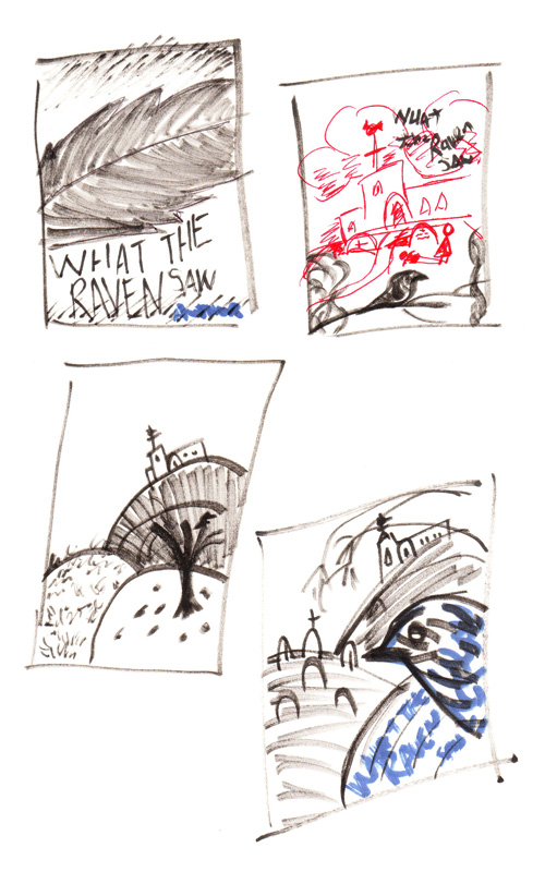
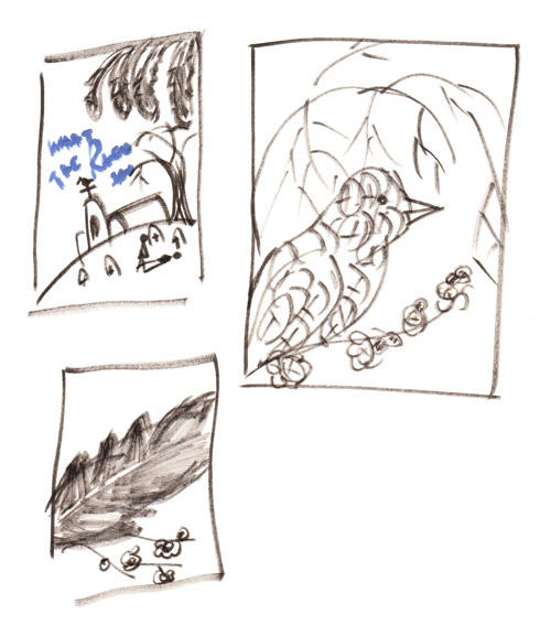
Once I was happy with the thumbnails I took to the computer and put together concepts using the low res photos of the illustrator’s paper ravens and found images. These were just to flesh out the concepts and give the publisher and illustrator a better idea of exact look and content I was after.


The publisher chose the middle concept and it went off to Tony the illustrator, who then created each element separately, photographed them and put it together loosely in photoshop.

An early version of the cover with hand drawn typography concept.
After a few more rounds of revisions we finalised the cover. I had rebuilt the illustration using the separate elements provided and we changed the colours around to add depth. Along with refining the typography.


This is the full cover, you can see another one of Tony’s fabulous paper creations also made an appearance — the annoying pigeon.
Happy with this cover the publisher created ARCs (advance reader copies) and sent them out and I went about my merry business. Excited at the thought of seeing this cover on the shelves.
Alas it was not meant to be, the publisher came back with good and bad news. The good news was that the response for this book was amazing, the bad news was the response wasn’t in the intended age range — older readers liked this book. So we needed to change the cover as it was far too young for this new audience.
After an afternoon of sulking I picked myself up and with the direction of the publisher, created the final cover.

And while it has lost some of its whimsical feel it still works for the story and I am very proud of the outcome.
If you’re interested in reading more about the content of this book there is a great review over here by Wendy Noble. The book is released tomorrow in Australia and should be available in all good book stores.